In the process of redesigning this site, I’m at a point where I’m not sure what I should be focusing on next. There’s layout, wireframing, a site map, a logo, textures, stock photos, self-created images/ photos, and many many more things. But after looking at some the sites I was inspired by, I saw a pattern that I really liked:
- Crisp edges
- muted, earthy tones
- some texture
- interesting typography
For the typography, I like the look of Frutiger LT, and created a simple text logo with that as the base.
I tried out some different kerning, and even whether to add a space between “Terry” and “Matula”. The top one I kerned each letter so that it only left about a pixel between each character. I’m not sure which one I like the best… and I played around with some colors and effects, so I might need to re-examine them later as a solid color.
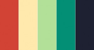
Speaking of color, I went over to Kuler and checked out some different schemes. Keeping with some of the colors from the sites I chose, I picked out the “2004” scheme, with just very slight modifications:
I’m pretty happy with that. Now I need to decide whether I want a dark-on-light or light-on-dark style. And what do I want to include on the site and where…

