7 Useful Twitter Bootstrap Resources (updated)

Twitter Bootstrap is a CSS framework that I’ve been using for all my projects recently.  It makes getting a nice looking design quick and easy.  The simplicity of it has made it possible for all sorts of resources and “hacks” to pop up.  Here are some that I’ve found…

  1. Built With Bootstrap
    A directory of sites that use Twitter Bootstrap. Many of them are easily identifiable by the grey nav bar and button styles, but some have really extended it.
  2. jQuery UI Bootstrap
    Bootstrap (especially v2) has some nice javascript included, but if you like jQuery UI and want it themed like Bootstrap, this will do it.
  3. Darkstrap theme
    If you’d prefer to have things not so “bright”, this theme will make a dark version of Bootstrap. It’s actually a separate file, so it doesn’t alter the actual Bootstrap CSS file.
  4. Bootswatch
    As of today, these are 6 nice, premade themes using altered Bootstrap.
  5. Lavish
    This is a pretty neat project.  You add in the URL for an image and it generates a color scheme for Bootstrap based on the colors in the picture.  You can get some nice results.
  6. Fbootstrapp
    A Bootstrap theme that mimics the Facebook design. It’s also designed to work really well if you develop canvas apps that will actually be viewed ON the Facebook site… keeping the design consistent. It’s still using v1.
  7. The Bootstrap customizer
    Finally, the customization page from Bootstrap. Choose only the elements you want in your CSS, change the default values, and download.


UPDATE ( 3/7/2012)

8. Font Awesome
“iconic font designed for use with Twitter Bootstrap”


Making a box “width” keep that width, even with padding.

I’m saving this Paul Irish post for later (or always) use from now on. There’s nothing worse than defining something as 400px wide with 20px padding left and right and… oh wait, NOW it’s actually 440px wide and screwing up the layout.  So if I want the box to REALLY be 400px wide, I have to define it as 360px wide… *sigh*

So here’s the code:

/* apply a natural box layout model to all elements */
* { 
    -moz-box-sizing: border-box; 
    -webkit-box-sizing: border-box; 
    box-sizing: border-box; 
}

CSS3 Gradients

I love CSS3 gradients… but I just can’t remember the syntax for both WebKit and Mozilla. That means, any new project I start where I want to use gradients, I run a Google search. One of the top results for CSS3 gradients is css-tricks.com. It’s a great article, but the Mozilla gradient example is over-complicated. Also, the two colors are in different orders between moz and webkit.  Personally, I think the top color should be on the left… for BOTH examples. So, more for my own personal reference, here’s a simplified CSS3 gradient code.

background:#ccc;

background: -webkit-gradient(linear, 0 0, 0 100%, from(#ccc), to(#eee));

background: -moz-linear-gradient(top, #ccc, #eee);

IE gets no gradient…. because, come on.

Updating My Site

I’m using a premade theme (boo), but I like some of the customization features it has.  Also, I don’t have the time right now to create a brand new, fancy WordPress theme.  I’d rather spend my free, web time working on getting things in order.  I’ve got so many files and images and documents from the past, I really want to organize it all and have my site work as a repository for all things me.  Though, isn’t that what most personal sites are for?

I also want this to be a place to peep my portfolio… because I’d like to start doing some more freelance work, and make some extra $$$.  And I want to start saying things like “peep my portfolio” WAY more often.

There’s also a dream of doing more “regular blogging” about web dev topics, and technology in general.  Because, from what I can tell, that is a TOTALLY untapped market.

One challenge I have is, what do I do with all the freaking’ sites I’ve posted other stuff too…. like Tumblr, Twitter, Facebook, Twitface, Faceumblr, and Linkedblritterbook?  Just pipe it in here I guess.

Change in direction

I decided to throw out all the design stuff I had come up with, and just do something I thought was fun. So I’m going to create an 8-bit website… because, why not? I envision a sea of animated email gifs and marquee tags. How wonderful!

Logo redesign, Site Map part 1

This evening, I still like my color palette, and last night I played around with the logo a bit. Here’s what I think is going to be close to a finished logo: Matula Logo test2

I like the simplicity and typography.  Also, it can be scaled down quite a bit, and the T and M still make it identifiable: Matula Logo Test - small

Next up, I need to figure out exactly what I want on my site.  Here’s a quick list, basically just a brain-dump:

  • Portfolio page
  • Blog
  • About/ Bio
  • Contact page/ form
  • Maybe sub-portfolio pages… one for Web Design, Development, Print work, or whatever
  • An experiment page, where I can post code demos or designs that I’m experimenting with
  • Links, both to stuff I’ve worked on and to pages I like
  • Tutorials/ Tips? Walkthroughs? May just keep that as part of the blog…
  • Pictures/ Photos / Video
  • Podcast? On something?

That’s just off the top of my head.  And some of those probably don’t need their own page, they could live in the sidebar or footer or something.

Something else I need to think about is do I want to just categorize my Posts or use WordPress 3’s new Custom Post Types? As I think about it, it might be easier to use the Custom Types, because I know sometimes I will forget to categorize things the correct way. With a Custom Type, I know that “Experiments” posts will always go to the right place.

Next, I’ll probably start sketching out some layout ideas and get my sitemap nailed down.

Finding a Color Scheme

In the process of redesigning this site, I’m at a point where I’m not sure what I should be focusing on next.  There’s layout, wireframing, a site map, a logo, textures, stock photos, self-created images/ photos, and many many more things.  But after looking at some the sites I was inspired by, I saw a pattern that I really liked:

  • Crisp edges
  • muted, earthy tones
  • some texture
  • interesting typography

For the typography, I like the look of Frutiger LT, and created a simple text logo with that as the base.

Frutiger LT font logo

I tried out some different kerning, and even whether to add a space between “Terry” and “Matula”. The top one I kerned each letter so that it only left about a pixel between each character.  I’m not sure which one I like the best… and I played around with some colors and effects, so I might need to re-examine them later as a solid color.

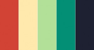
Speaking of color, I went over to Kuler and checked out some different schemes.  Keeping with some of the colors from the sites I chose, I picked out the “2004” scheme, with  just very slight modifications:

portfolio color scheme

I’m pretty happy with that. Now I need to decide whether I want a dark-on-light or light-on-dark style.  And what do I want to include on the site and where…

Inspiration

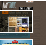
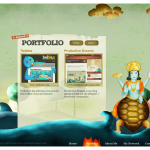
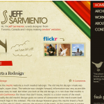
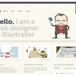
Went through some sites with links to interestingly designed site.  Here are a few screenshots I captured.  Without thinking to much about them, I just grabbed ones that simply appealed to me. Next, I’ll try figure out why I like them…

New Site

I figure the first topic I’m going to blog about is the process of updating my site.  First thing, I updated my site to WordPress 3… because WP is just awesome.  My next step is to get a design I like.

I’ve got a couple of things I’m doing now. One, try and find some inspiration, specifically with a self-evident Google search.  I’m also gathering some resources, mostly from this great Smashing Mag post but I also downloaded this 960 Grid to play around with.

For the design, I really want something that reflects who I am.  The problem is, I’m not quite how that will work. Do I do a dark background with light text, minimal design, colors, retro, grunge? Or something else?  A lot of times, I’ll see a site I like and use that as inspiration… but it’s not really me.  It’s just a design I like the look of.